HealthSync
Designing a Clear & Actionable Wellness Dashboard
A UX/UI case study that simplifies complex health data into meaningful daily insights.
The Project:
HealthSync is a comprehensive health intelligence platform designed to aggregate fragmented biometric data into a single, intuitive dashboard. By bridging the gap between raw numbers and daily habits, HealthSync empowers users to take control of their well-being through clarity and actionable insights.

The Context:
With the rise of wearable tech (Apple Watch, Oura, Fitbit), users are constantly bombarded with metrics. However, most health apps suffer from "Data Silos"—where sleep data lives in one app and activity in another. This fragmentation makes it nearly impossible for the average user to see the "big picture" of their health.

Problem Statement
Many wellness apps present overwhelming amounts of data, making it difficult for users to assess their progress or stay motivated quickly. The challenge was to create a dashboard that feels clear, calm, and actionable.

The Goal:
To design a comprehensive health dashboard that transforms complex biometric data into clear, actionable insights for everyday users.
Research & Insights
Since this is a conceptual project, I based my design decisions on common behavioral patterns in health app usage and publicly available UX research on dashboard design.
The goal was to design a hardware-agnostic hub that prioritizes clarity over complexity, reducing cognitive load by translating raw health metrics into intuitive visual trends.
Visual Strategy & Design System
The HealthSync logo is a fusion of two 'S' shapes, carefully intertwined to form a double helix structure, symbolizing DNA.
This visual metaphor represents the platforms core mission: deciphering human biology through personalized data.
Typography
Poppins
A B C D E F G H I J K L M N O P Q R S T U V W X Y Z
Nunito
A B C D E F G H I J K L M N O P Q R S T U V W X Y Z
Colors
WireFrame
Screens
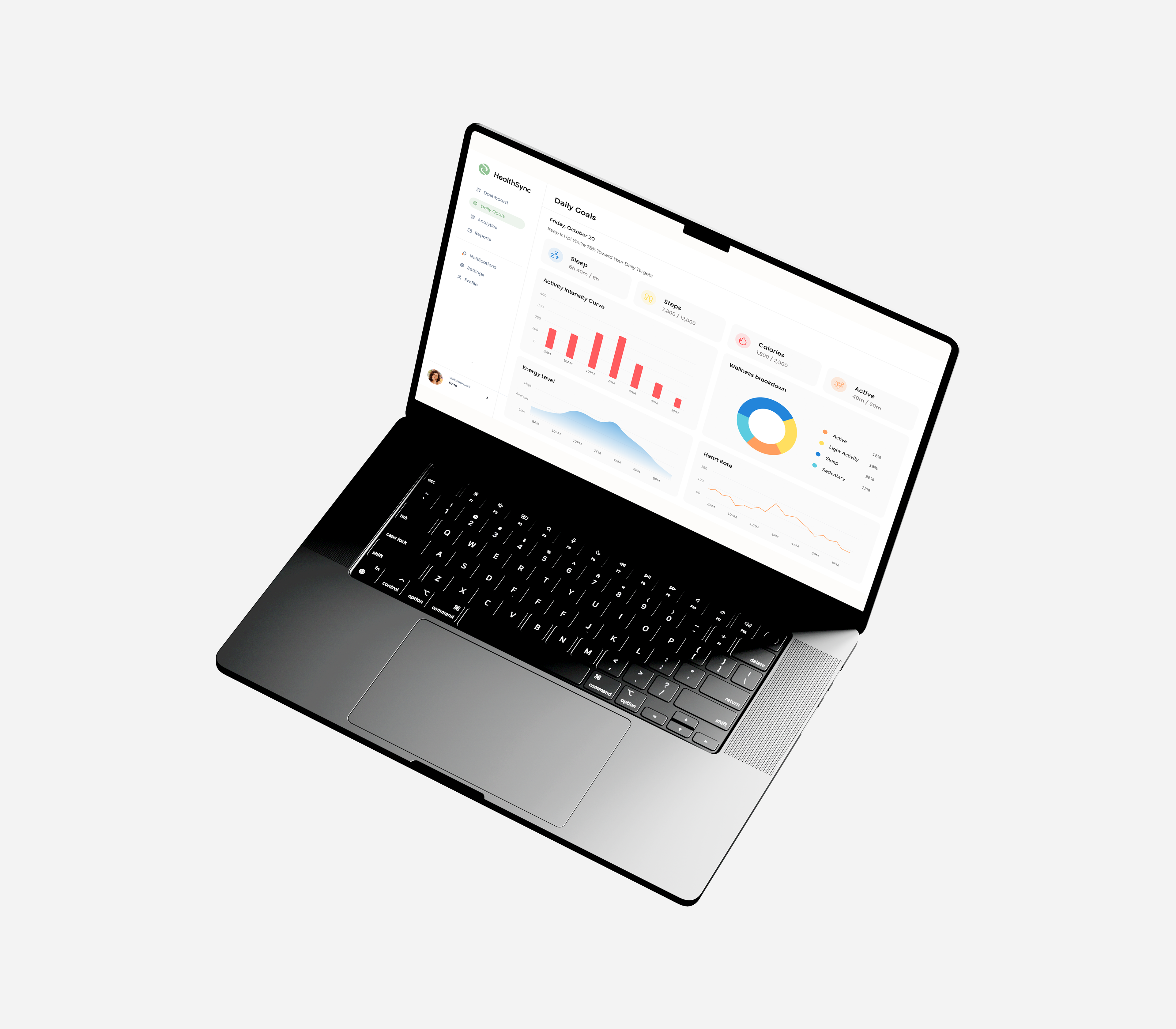
Daily Goals - A day-at-a-glance view of sleep, steps, calories, and activity, built so users can check in without digging through menus.
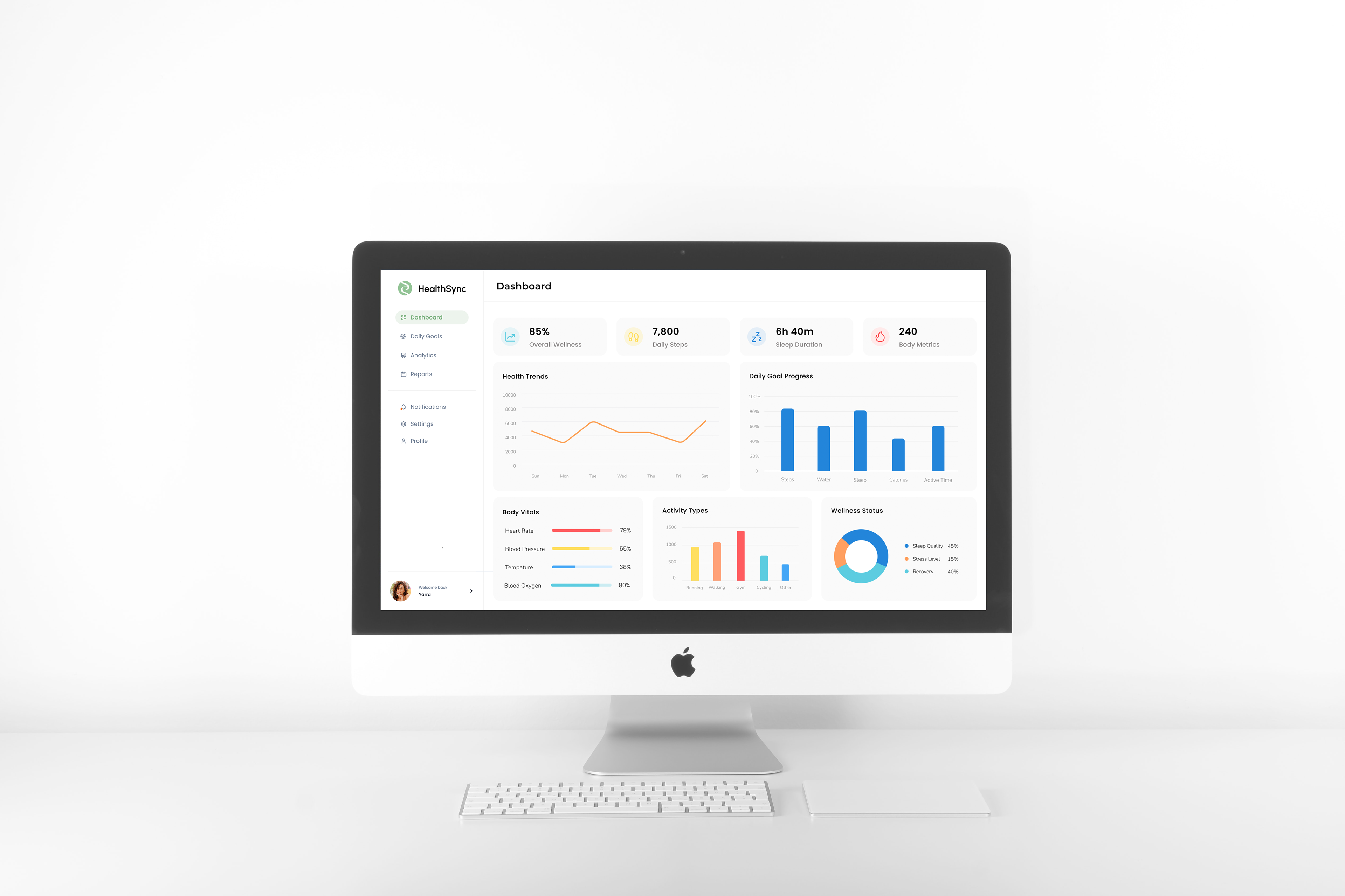
Dashboard - The main hub, surfacing weekly trends and overall wellness status at a glance, so users notice patterns over time instead of isolated numbers.
HealthSync was an exercise in restraint - figuring out what to leave out, not just what to include. If I took this further, I'd want to test it with real wearable-tech users to see whether the assumptions I designed around short attention spans and data overload actually match how people use the app day-to-day.

MORE OF MY PROJECTS

Back to Top