Enerlytiq - Redesign
Elevating Energy Intelligence through Modern UI/UX
A comprehensive redesign of the Enerlytiq platform, focusing on simplifying complex data structures and creating a high-end, trustworthy visual identity.
The Challenge: From Static to Strategic
The Project:
Enerlytiq is a Canadian-based energy intelligence firm. The goal was to take their existing web presence and transform it into a cutting-edge SaaS experience that matches their sophisticated technology.

The Problem (The "Before"):
The original website (enerlytiq.ca) felt static and lacked a clear visual hierarchy. For a company dealing with "Intelligence" and "Automation," the UI didn't communicate "High-Tech" or "Efficiency" effectively to potential enterprise clients.

The Goal:
Create a "Command Center" feel. The new design needs to scream Authority, Data-Precision, and Modernity, ensuring that complex energy metrics feel accessible and actionable.

Visual Strategy: The "New" Brand DNA
Logo & Symbolism: Precision meets Dynamics​​​​​​​
Concept: The "Bolt-E", A fusion of a lightning bolt and a modern, geometric structure.
Vibe: High-tech, energetic, and authoritative.
The Improvement: I wanted to create a symbol that shouts "Energy" from the first second. The bold, thick strokes ensure the logo remains legible on any screen size. By combining the bolt with a structured, upward-sloping shape, I balanced Power with Stability.
Typography: Moving to a clean, geometric Sans-Serif to ensure readability across data-heavy dashboards.
Iconography: Using Line-Art Icons with Glow effects to symbolize the "flow" of energy and data.
Typography:
Plus Jakarta Sans
A B C D E F G H I J K L M N O P Q R S T U V W X Y Z 
Inter
    A B C D E F G H I J K L M N O P Q R S T U V W X Y Z 
The Color Palette
Deep Navy Blue: Chosen to represent Trust and Stability. It honors the heritage of the parent company,
Electric Turquoise: Used as the primary accent to represent AI and Innovation. It provides a high-tech "pulse" that guides the user’s eye.
Wireframe
Screens
The Overview
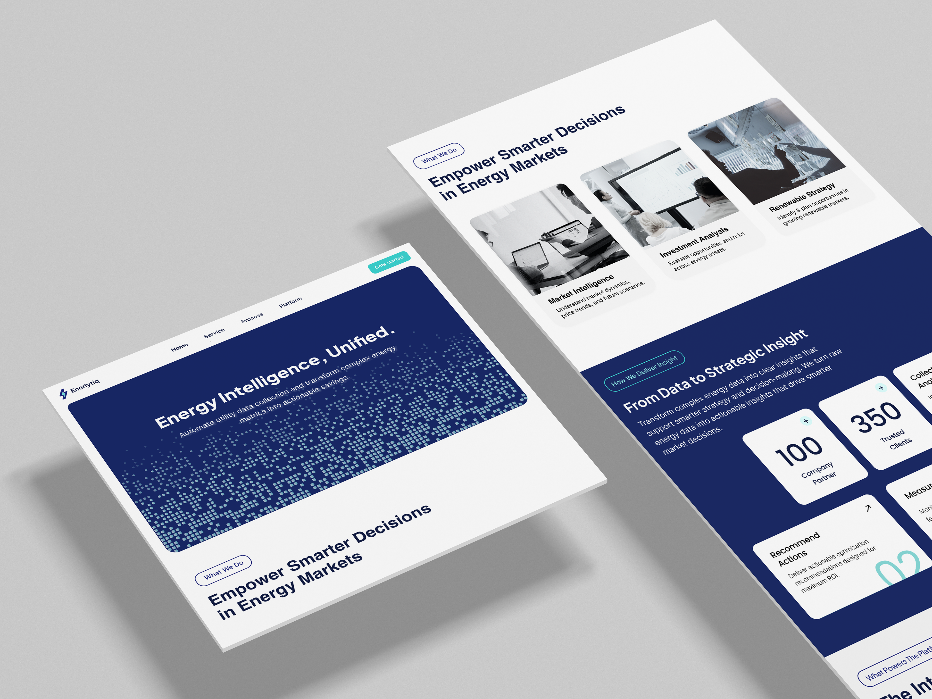
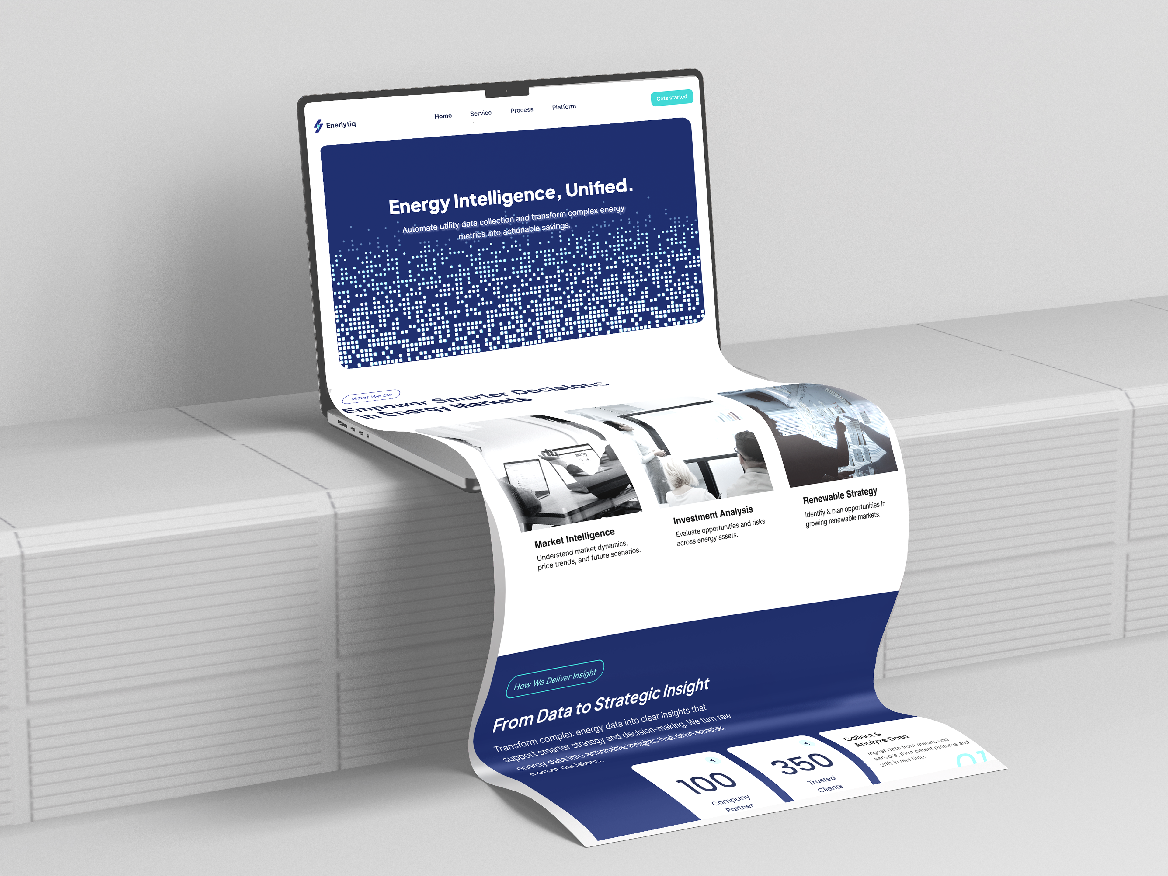
Heading: Strategic Command                                                                   Content: The landing page begins with a high
impact Hero section.
I focused on a clear value proposition: "Energy Intelligence, Unified." By using a tech-grid visual and a primary CTA, the goal is to immediately establish Enerlytiq as a high-tech authority.
The layout is designed to guide the user’s eye from the core mission directly to the conversion point.
Smart Insights
Heading: Data-Driven Decision Making
Content: This section breaks down complex
services into three focused pillars: Market Intelligence, Investment Analysis, and Renewable Strategy
Each card is designed with high legibility and clear iconography. The logic here is to help enterprise users quickly identify which business problem the platform solves for them, reducing cognitive load right at the start.
The Dashboard Preview
Heading: Transparency Through Product Preview
Content: One of the most critical UX decisions was
embedding a "Sneak Peek" of the actual platform
By showcasing real-time analytics and SEO-style energy metrics, we build immediate trust. Users can see the clean, professional, and powerful interface they will interact with, proving that the platform is as sophisticated as its marketing suggests.
Segmentation
Heading: Tailored for Industry Leaders
Content: Enerlytiq serves a diverse market designed a dedicated section for Investors, Utilities, and Developers to ensure a personalized user journey. Each segment has its own dedicated CTA, creating a direct conversion path. This organization ensures that, regardless of the user's role, they can find the value relevant to their organization within seconds.

More of my projects

Back to Top